

Cleanlab Vizzy is an interactive visualization of confident learning — a data-centric AI family of theory and algorithms for automatically identifying and correcting label errors in your datasets. Confident learning enables you to train a model on bad labels that’s similar in performance to the model you would have had if you had trained on error-free data.
We built our company using confident learning and wanted to illustrate one of the primary algorithms of the field for a wider audience – we’ll refer to this as the “Cleanlab algorithm”. This post first introduces the intuition and theory behind the algorithm and then delves into how we built an in-browser visualization of it finding errors in a small image dataset.
Background
Briefly, the Cleanlab algorithm involves:
(1) Generating out-of-sample predicted probabilities for all datapoints in a dataset: We train on a dataset’s given labels with 5-fold cross-validation to obtain these probabilities.
(2) Computing percentile thresholds for each label class based on the predicted probabilities: Comparing predicted probabilities against per-class percentile thresholds can be informative. By percentile threshold, we mean that for some label class, we aggregate the corresponding predicted probabilities for that class for all datapoints that have that given label. Using these probabilities, we can compute values at each percentile (e.g. the median value is at the 50th percentile) and use these as thresholds.
Intuitively, these thresholds can be used to distinguish which datapoints are more or less likely to have a given label:
- For example, datapoints with class probabilities exceeding a high class percentile threshold are more likely to have the corresponding class label.
- Conversely, datapoints with class probabilities below a low class percentile threshold are unlikely to have the corresponding class label.
For a specific datapoint, if its predicted probability is below this low percentile threshold for each class, it may be the case that the datapoint belongs to none of the classes, i.e. it is out of distribution.
That’s all you need to know to understand the rest of this post.
Implementation
We built our visualization using React, Typescript, and Chakra UI. (Chakra UI has particularly good support for dark mode!)
Taking a leaf out of playground.tensorflow.org, we deliberately constrained the visualization to fit within the browser window so that scrolling is not needed.
We also wrote the application to run entirely in the browser, including model training and evaluation. This avoids any latency from having the frontend communicate with a backend.
Dataset
For visual appeal and interpretability, we showcase the algorithm working on an image dataset.
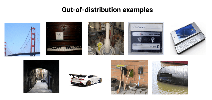
To construct the dataset, we manually selected 300 images from ImageNet, sampling mainly from images of dogs, cats, and bears. We include 97 examples of each of these classes. For the remaining 9 images, we randomly selected pictures of non-animals. These serve as out-of-distribution images.
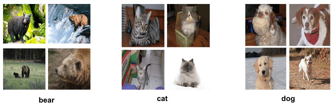
The images of dogs, cats, and bears mostly have the correct given label, except for 3 examples in each class, which are deliberately given an incorrect label. The out-of-distribution images are randomly assigned to one of the animal classes. Overall, this means that our dataset of 300 images has 18 errors.
Generating predicted probabilities
To generate predicted probabilities, we have to train an image classifier on the dataset.
One option is to train a neural network in the browser from scratch, and Javascript libraries like ML5 and ConvNetJS are good choices for this. However, even for a small dataset, this can take up to a few minutes depending on the complexity of the neural network.
Instead, to optimize for speed, we pre-computed image embeddings using a pre-trained ResNet-18 model. For each image, using the penultimate layer in the model, we obtain a 512-dimensional image embedding that serves as a high quality compressed representation of the image. During training time, the app uses these embeddings to train an SVM classifier (LIBSVM-JS) to quickly obtain the predicted probabilities.
Given the small size of our dataset (), we reduce the dimensionality of each vector to 32 using truncated singular value decomposition, as the dimensionality of the inputs should not exceed the number of examples the classifier learns from. This also speeds up training of the SVM classifier to a fraction of a second.
As a sanity check, we used t-SNE to represent these datapoints on a 2-dimensional plot to verify that the image embeddings were being generated correctly.
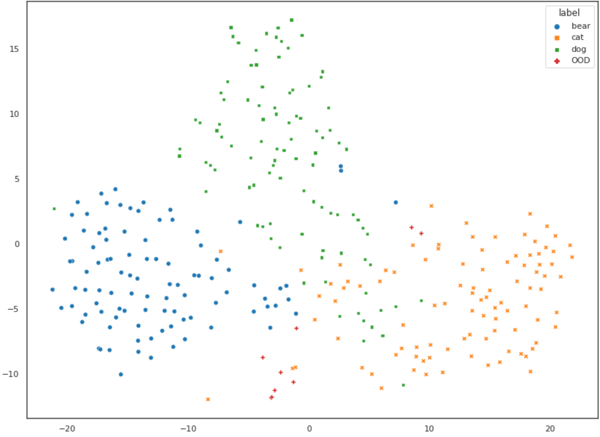
The data is clustered fairly well into the three classes. We can see that the clusters for cats and dogs are overlapping somewhat, while the cluster for bear is relatively distinct, which is what we would expect intuitively given the relative sizes of these animals. The datapoints that are out-of-distribution mostly lie further away from the centroids of the three clusters. All is well!
Computing class thresholds
With the predicted probabilities, computing percentile thresholds for each class is straightforward. By default, we set the class thresholds at the 50th percentile (aka the median), and the out-of-distribution thresholds to the 15th percentile. However, sliders in the app allow the users to set this to anywhere from the 0th to 100th percentile.
Note that:
- A higher class threshold would mean that any errors identified are found with higher confidence.
- A lower out-of-distribution threshold means that any out-of-distribution examples identified are found with higher confidence.
Fun fact: According to the original paper, how different percentile thresholds perform in identifying label errors is still unexplored future work!
Putting it all together
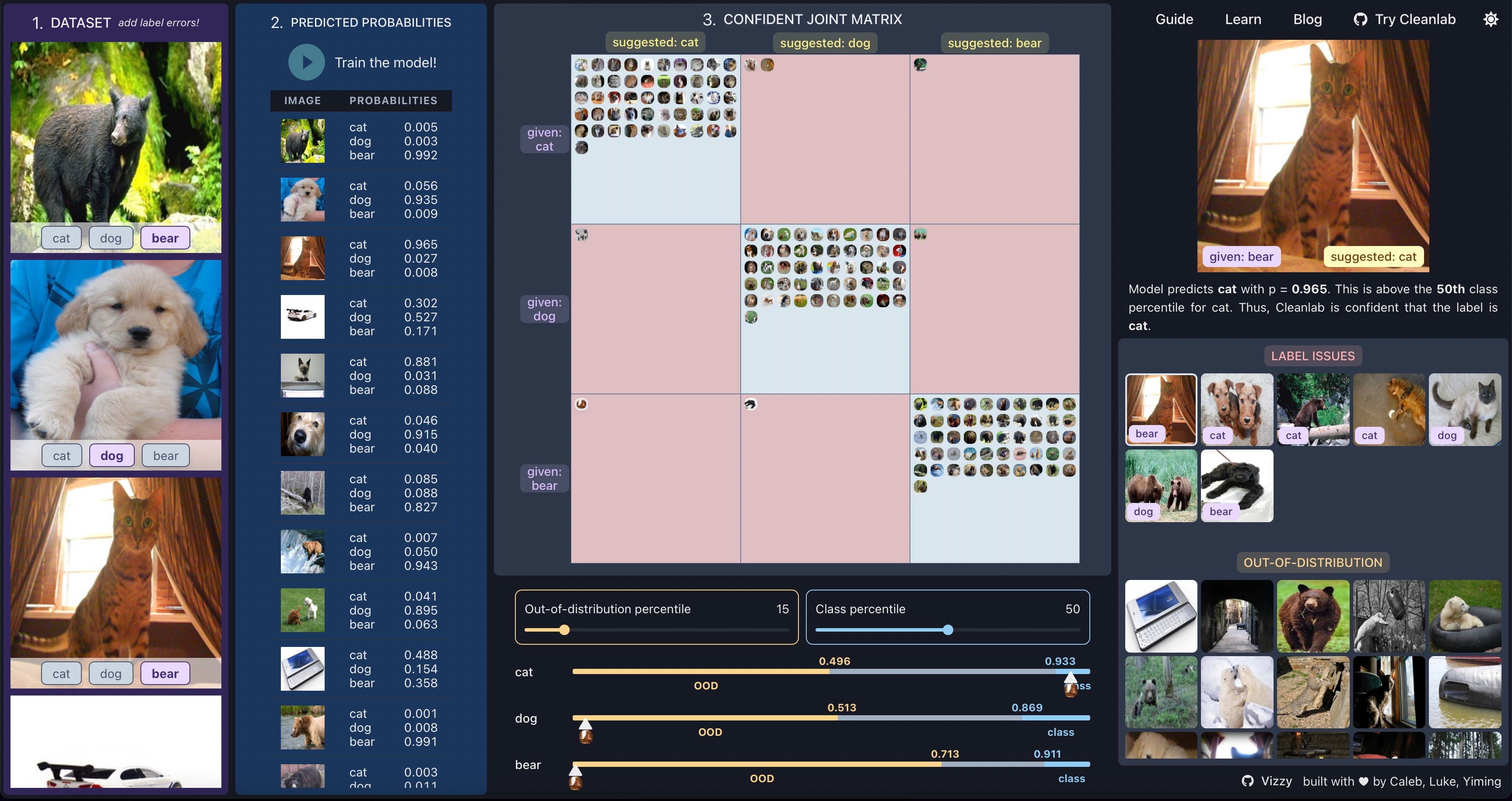
Based on the predicted probabilities and class / out-of-distribution threshold, we can categorize every datapoint based on its given label and Cleanlab’s suggested label.
In this case, since we have three classes, we can construct a 3 x 3 matrix to represent these two dimensions (given label, suggested label). This is the confident joint matrix.
Datapoints that do not make it into the confident joint (i.e. Cleanlab was not confident enough to suggest a label) are categorized as either out of distribution or examples Cleanlab is not confident about. (Any image that is not in the confident joint or the set of out-of-distribution images is an image Cleanlab is not confident about.)
If you have made it this far, you now have a better understanding of how Cleanlab’s algorithm for automated label detection and correction works and how we built our visualization for it. The code for our visualization is open source. You may also want to check out the Cleanlab repository for our open-source Python package, or join our Slack community if you are broadly interested in data-centric AI.
While cleanlab helps you automatically find data issues, an interface is needed to efficiently fix these issues your dataset. Cleanlab Studio finds and fixes errors automatically in a (very cool) no-code platform. Export your corrected dataset in a single click to train better ML models on better data. Try Cleanlab Studio at https://studio.cleanlab.ai/.